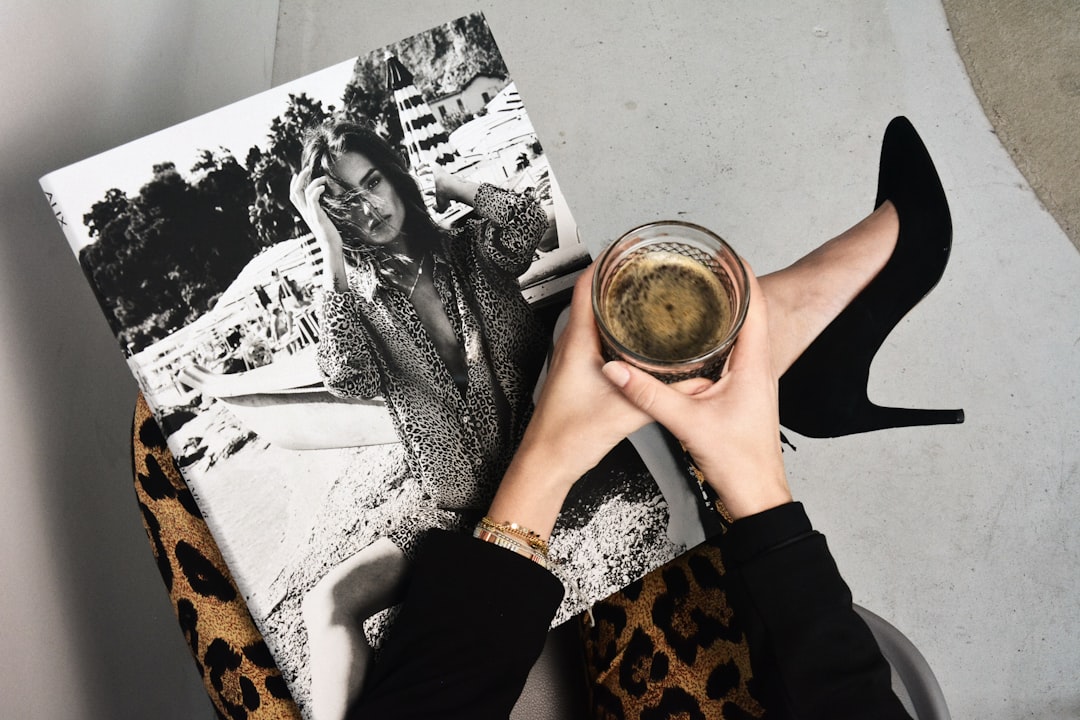

Color is one of the most powerful tools in your style arsenal. The right colors can brighten your complexion, make you appear more vibrant and healthy, and even affect how others perceive you. Yet many people struggle with understanding which colors work best for them.
In this comprehensive guide, we'll demystify color theory and provide practical steps to help you discover your perfect personal palette—the colors that make you look and feel your absolute best.
Understanding the Basics: Color Theory 101
Before we dive into personal color analysis, it's helpful to understand some fundamental concepts of color theory:
- Hue: The pure color itself (red, blue, green, etc.)
- Value: The lightness or darkness of a color
- Chroma/Saturation: The intensity or purity of a color
- Temperature: Whether a color is warm (yellow-based) or cool (blue-based)
- Undertone: The subtle color beneath the surface that affects how colors appear against your skin
These concepts form the foundation of personal color analysis and will help you understand why certain colors work better for you than others.
The Four Seasonal Color Types
The seasonal color analysis system categorizes people into four main types based on their natural coloring. While this system has evolved, it remains a helpful starting point for understanding color harmony:
Spring
Characteristics: Warm undertones, light to medium hair color (often with golden or strawberry blonde highlights), light eyes (blue, green, or light hazel), and fair to medium skin with golden or peach undertones.
Best Colors: Warm, clear, and bright colors like coral, peach, golden yellow, aqua, and camel. Avoid colors that are too dark or muted.
Summer
Characteristics: Cool undertones, ash-toned hair (from blonde to medium brown), cool blue, green, or gray eyes, and fair to medium skin with pink or olive undertones.
Best Colors: Cool, soft, and muted colors like lavender, rose, powder blue, plum, and soft gray. Avoid overly bright or warm colors.
Autumn
Characteristics: Warm undertones, rich hair colors (auburn, chestnut, golden brown, dark blonde), warm eye colors (brown, hazel, green), and golden or olive skin tones.
Best Colors: Rich, warm, and earthy tones like olive green, mustard, burnt orange, rust, and chocolate brown. Avoid cool, pastel, or neon colors.
Winter
Characteristics: Cool undertones, dark hair (black or dark brown), high contrast between hair, skin, and eyes, and fair to dark skin with blue or pink undertones.
Best Colors: Clear, cool, and vivid colors like true red, fuchsia, royal blue, emerald green, and pure white. Avoid muted, earthy, or warm pastel colors.
How to Determine Your Undertone
Identifying whether you have warm or cool undertones is the most crucial step in finding your perfect palette. Here are several methods to help you determine your undertone:
The Vein Test
Look at the veins on the inside of your wrist in natural light:
- Blue or purple veins: Cool undertones
- Greenish veins: Warm undertones
- Blue-green veins: Neutral undertones (can wear both warm and cool colors)
The Jewelry Test
Which metal looks better against your skin?
- Silver jewelry: Cool undertones
- Gold jewelry: Warm undertones
- Both look equally good: Neutral undertones
The White Test
Hold a piece of pure white fabric and an off-white or cream fabric near your face:
- Pure white brightens your complexion: Cool undertones
- Off-white/cream brightens your complexion: Warm undertones
The Sun Test
How does your skin react to sun exposure?
- Burns easily, tans with difficulty: Cool undertones
- Tans easily, rarely burns: Warm undertones
Beyond Seasons: The 12-Tone System
While the four-season system is helpful, many color analysts now use a more precise 12-tone system that considers three dimensions:
- Temperature: Warm vs. Cool
- Value: Light vs. Dark
- Chroma: Bright vs. Muted
This system creates more specific categories like "Bright Spring," "Soft Summer," or "Dark Winter," offering more personalized color recommendations.
Building Your Personal Color Palette
Once you've identified your undertone and seasonal type, you can build a personalized color palette. A well-balanced palette should include:
- Neutrals: 3-5 foundation colors for basics and investment pieces
- Accent Colors: 5-8 colors that complement your neutrals and add interest
- Statement Colors: 2-3 bold colors for special pieces and accessories
Your personal palette should reflect not only what flatters you but also what you genuinely love to wear.
Practical Application: Incorporating Your Palette
Knowing your colors is one thing—incorporating them effectively into your wardrobe is another. Here are practical strategies:
Start with Neutrals
Build your foundation with neutrals that work for your palette. For cool undertones, this might mean charcoal gray, navy, and taupe. For warm undertones, consider camel, olive green, and warm browns.
Use Color Strategically
Place your most flattering colors near your face in tops, scarves, and jewelry. You can be more adventurous with colors in bottoms and accessories.
Create Cohesion
Ensure all the colors in your wardrobe work well together. This doesn't mean everything has to match perfectly, but there should be harmony across your collection.
Consider Color Proportions
Use the 60-30-10 rule as a guideline: 60% dominant color (usually a neutral), 30% secondary color, and 10% accent color.
Common Color Mistakes and How to Avoid Them
Even with good intentions, many people make these common color mistakes:
- Wearing colors that are too bright or too muted for their contrast level - Solution: Match color intensity to your natural contrast
- Ignoring the effect of color value (lightness/darkness) - Solution: Consider whether light, medium, or dark colors flatter you most
- Sticking exclusively to "safe" neutrals - Solution: Experiment with colorful neutrals that work for your palette
- Forgetting that makeup affects color perception - Solution: Test colors while wearing your typical makeup
Color and Psychology: How Colors Affect Perception
Beyond physical flattery, colors carry psychological associations that can influence how others perceive you:
- Blue: Trust, calm, competence
- Red: Energy, passion, confidence
- Green: Balance, growth, harmony
- Black: Sophistication, authority, elegance
- Yellow: Optimism, creativity, warmth
- Purple: Luxury, creativity, wisdom
Consider these associations when choosing colors for different contexts, from professional settings to social events.
Adapting Your Palette for Different Contexts
Your perfect palette should be versatile enough to work across different areas of your life:
Professional Settings
Focus on your most sophisticated neutrals and subtle accent colors. Navy, charcoal, and deep burgundy often work well in professional environments.
Casual Wear
This is where you can have fun with brighter accent colors and more relaxed combinations.
Evening and Special Occasions
Incorporate your most striking statement colors and don't be afraid to play with metallics and textures.
Final Thoughts: Color as Self-Expression
While color theory provides valuable guidelines, remember that personal style is ultimately about self-expression. The "perfect" palette is one that not only flatters you physically but also resonates with your personality and brings you joy.
Use color theory as a tool rather than a strict rulebook. Experiment, take notes on what you receive compliments on, and pay attention to how different colors make you feel. Over time, you'll develop an intuitive sense of which colors are truly "yours."
Ready to discover your perfect palette with professional guidance? Contact us to book a personal color analysis session with our expert stylists.